Goals
- Appeal to broader audiences through a cleaner and more modern visual design
- Enhance usability by simplifying navigation and adding search filters
- Increase trust and reliability through transparency and safety features
As the UI Designer, I was responsible for:
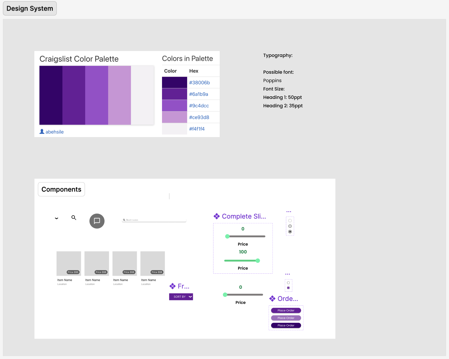
- Creating consistent and reusable design components (buttons, cards, forms, icons)
- Establishing and maintaining a design system to ensure visual and functional consistency
- Aligning typography, color schemes, and layout across all fidelity stages
- Collaborating with teammates to incorporate user feedback into the design process
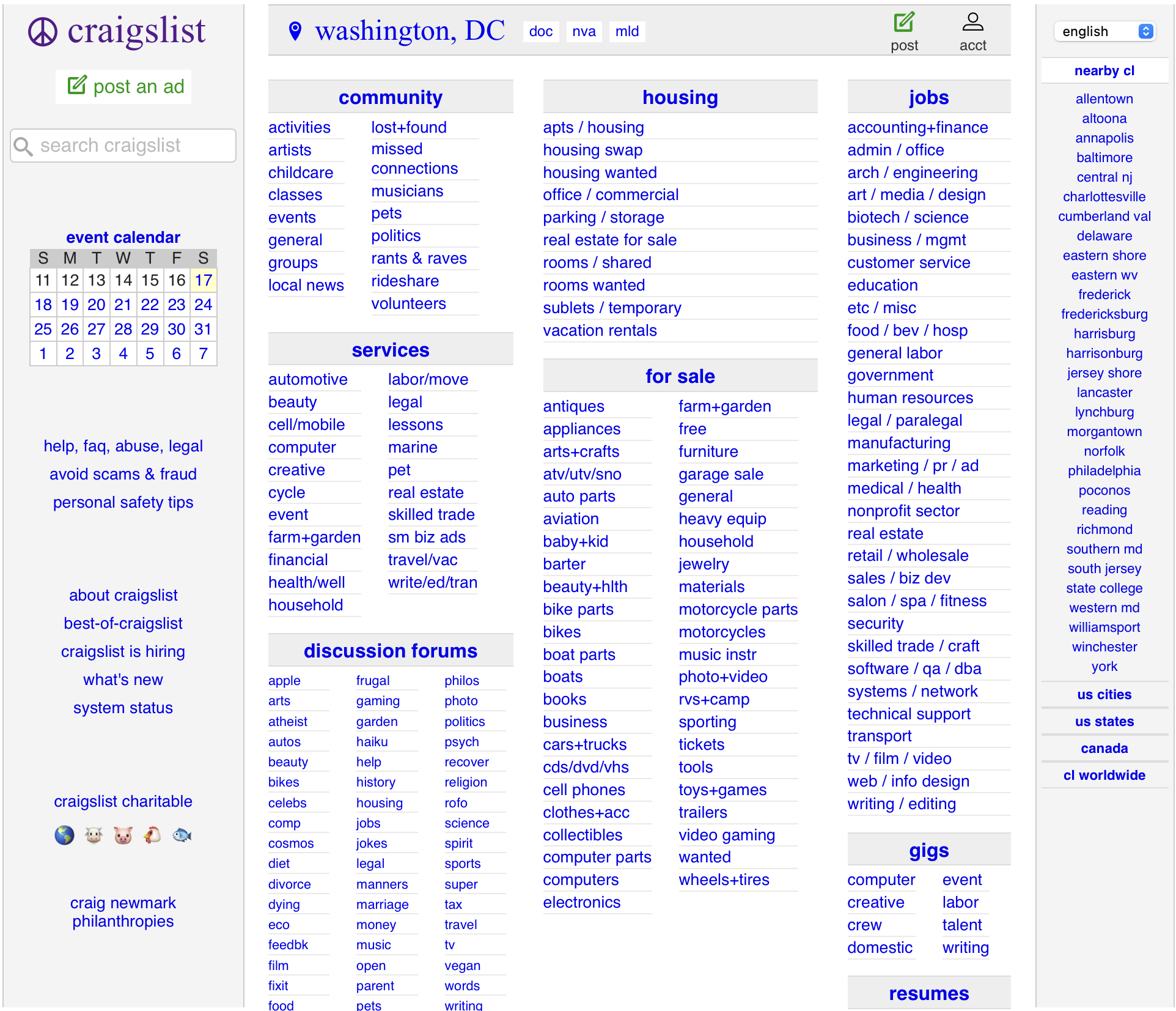
Craigslist is a widely used platform, but its interface has not significantly evolved in over a decade. While it functions well at a basic level, users consistently report critical usability and trust issues, including:
- Outdated Visual Design: The platform is overwhelmingly text-based, lacking visual hierarchy and modern UI elements. This leads to user fatigue and frustration, especially for mobile users.
- Poor Navigation: Users struggle to browse categories or search effectively. The lack of filtering and inefficient layout makes it difficult to locate relevant items or services.
- Lack of Trust and Safety Features: Craigslist doesn’t offer user profiles, ratings, or in platform messaging making it hard to verify identities or build trust between buyers and sellers.
- Limited Mobile Optimization: With a growing number of users accessing Craigslist via mobile devices, the desktop first experience fails to deliver a smooth and responsive interface on smaller screens.
These problems not only hinder usability but also discourage new users and reduce engagement over time. Our redesign set out to address these issues while preserving the simplicity and accessibility that Craigslist is known for.
Design Principles
- Minimal but Modern: Maintain Craigslist's essence while introducing visual clarity
- User-Centric Navigation: Simplified menus and mobile-friendly layouts
- Trust & Transparency: Introduced user ratings, profiles, and reporting tools
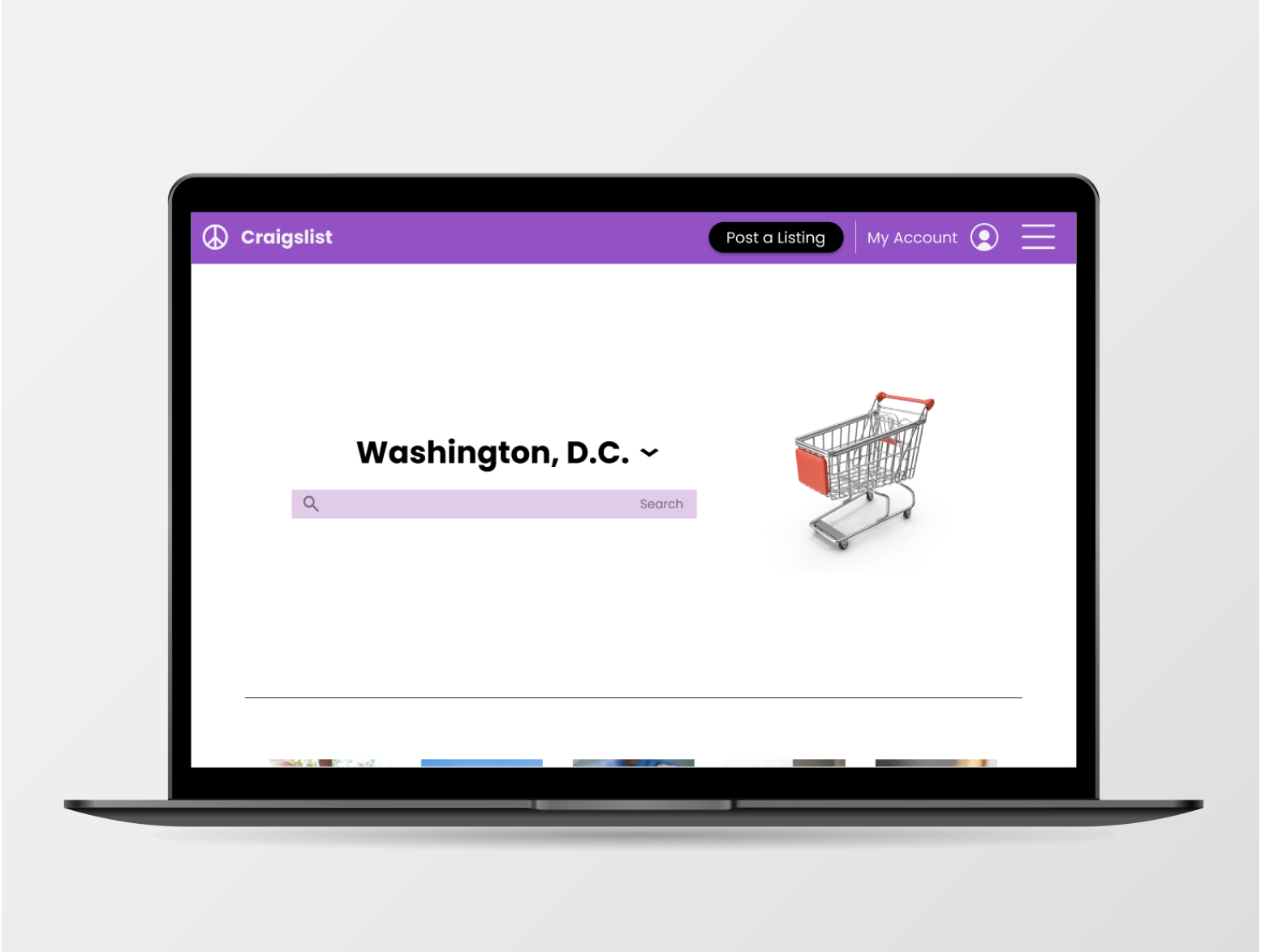
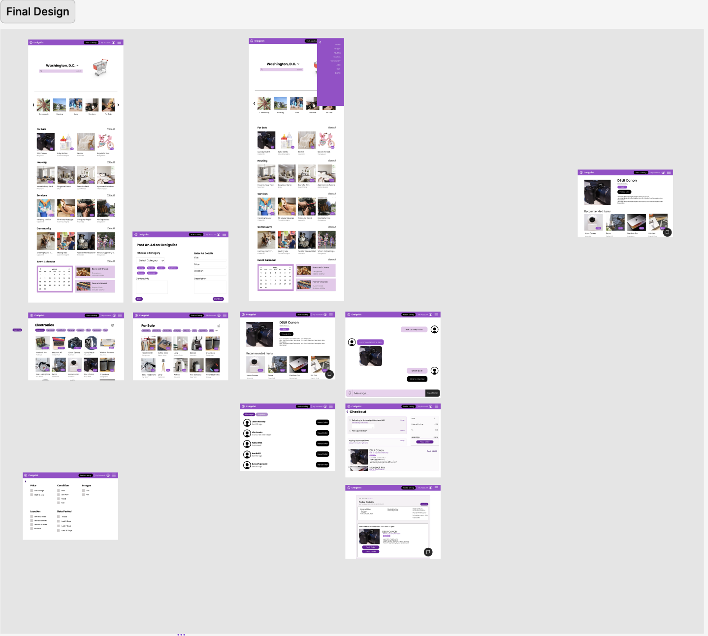
Visual Design
- Color Palette: Maintained the recognizable Craigslist purple, contrasted with clean white backgrounds
- Typography: Selected legible, modern typefaces aligned with the platform’s minimalist identity
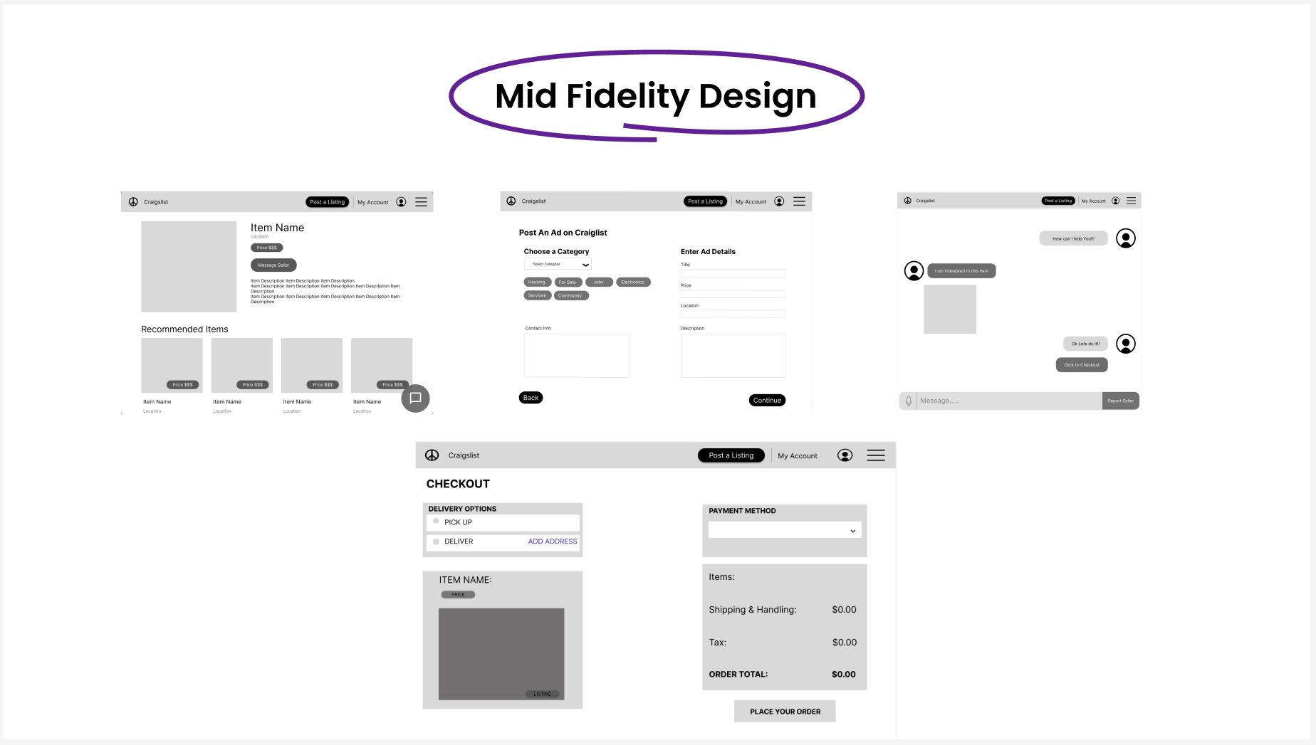
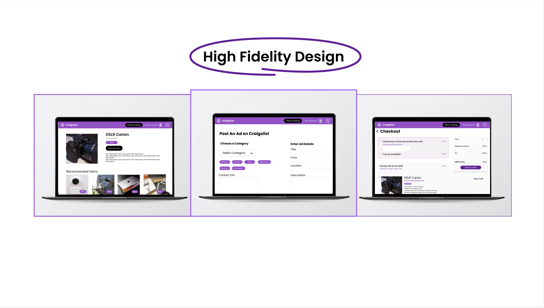
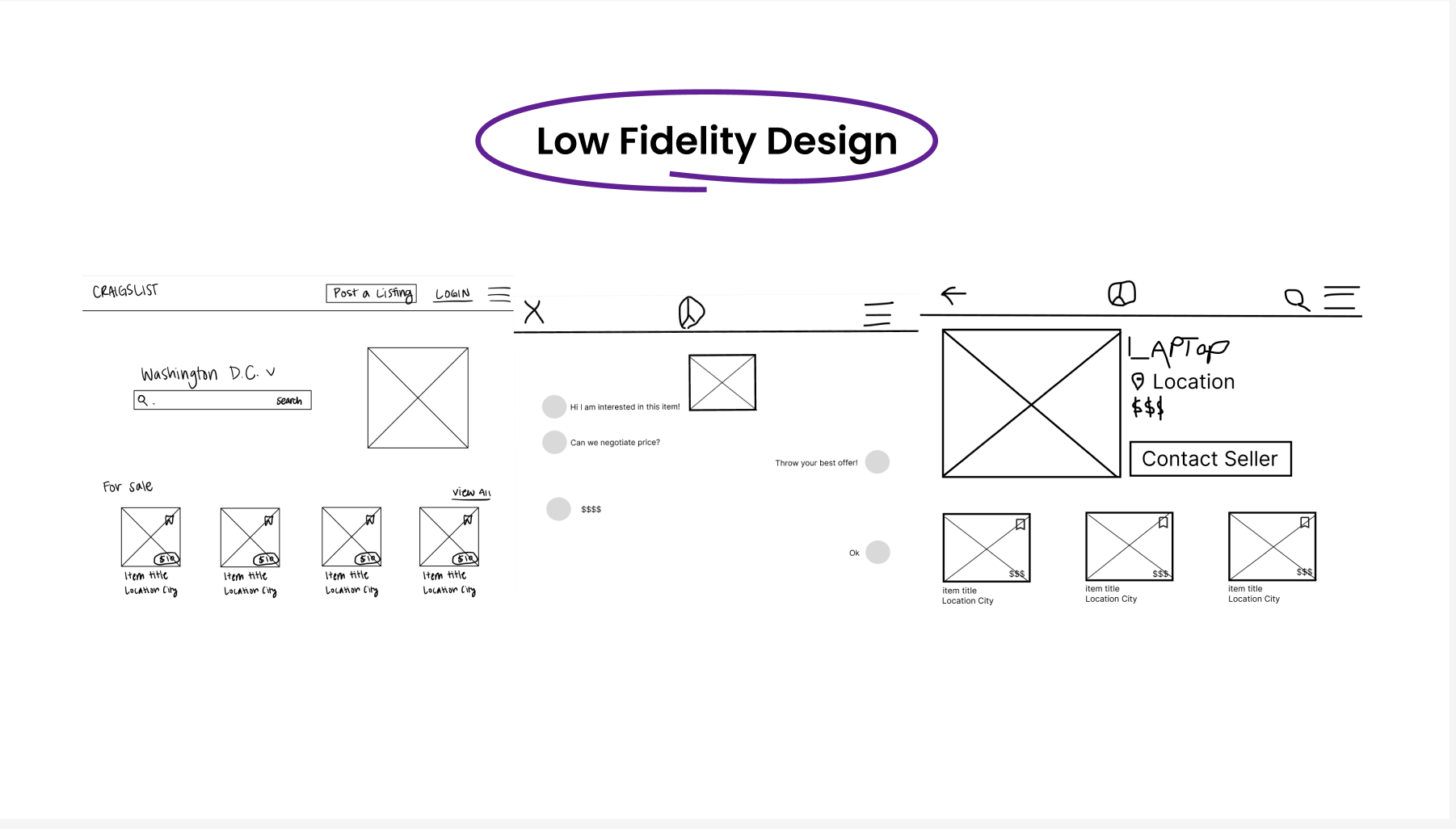
Key Features Introduced
- Advanced Search Filters: Filter by price, location, category, and item condition
- Verified User Profiles: Builds credibility and helps identify trustworthy sellers/buyers
- Messaging & History: In-app communication and saved conversations
- Visual Post Enhancements: Posts now include multiple images and rich descriptions
- Saved Listings: Users can bookmark and revisit items
- Confirmation & Checkout Pages: Introduced for transactional flow (optional feature)
Research Process
Survey
We conducted a survey with 30 users, ranging in age and experience levels with Craigslist. The survey aimed to uncover usage patterns, frustrations, and desired features.
Key Survey Questions
- What do you use Craigslist for?
- How easy is it to navigate (1–5)?
- What are your biggest frustrations?
- How trustworthy do you find listings (1–5)?
- Do you use it more on mobile or desktop?
- What features would you like to see?
- Would a modern redesign increase your usage?
Survey Insights
MetricFindingsTop Uses70% buying/selling, 50% housing, 35% job searchingNavigation RatingAverage 2.8 / 5; described as “too text-heavy” and “confusing”Trust RatingAverage 2.5 / 5; low trust due to lack of verificationDevice Use60% mobile, 40% desktopMost Requested FeaturesFilters, profile verification, saved listings, cleaner UI
User Pain Points
- Outdated Interface: Overwhelming text, lack of visual hierarchy
- Poor Navigation: Hard to browse categories or return to previous pages
- Low Trust: No user profiles, ratings, or content moderation
- Limited Features: No filters, poor media support, and no communication tools
Competitive Analysis
PlatformStrengthsFacebook MarketplaceProfile visibility, localized experience, modern designOfferUpIn-app messaging, payment integration, user ratingsGumtreeClean interface, intuitive categories, region-specific listings
These platforms successfully implement features Craigslist lacks, such as user verification, robust filters, and sleek UIs.
Design Solution
Design Principles
- Minimal but Modern: Maintain Craigslist's essence while introducing visual clarity
- User-Centric Navigation: Simplified menus and mobile-friendly layouts
- Trust & Transparency: Introduced user ratings, profiles, and reporting tools
Visual Design
- Color Palette: Maintained the recognizable Craigslist purple, contrasted with clean white backgrounds
- Typography: Selected legible, modern typefaces aligned with the platform’s minimalist identity
Key Features Introduced
- Advanced Search Filters: Filter by price, location, category, and item condition
- Verified User Profiles: Builds credibility and helps identify trustworthy sellers/buyers
- Messaging & History: In-app communication and saved conversations
- Visual Post Enhancements: Posts now include multiple images and rich descriptions
- Saved Listings: Users can bookmark and revisit items
- Confirmation & Checkout Pages: Introduced for transactional flow (optional feature)